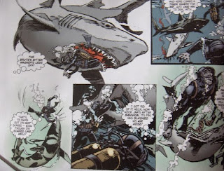
Never noticed it as i was so keen on studying the full colour - and i certainly didn't need to read it, as i'm darn near word perfect on this opening episode.
I can see why they did it, and they did it well, but i do prefer the standard for that time, typed text and those odd straight-lined speech balloons.


Looking closer, its rather curious as its not just a straight erasing of the original and putting a new one in.
In many cases the speech balloon has been moved elsewhere in the panel to allow for it, resulting in some of the art being covered up.
And the old balloon has been removed, either uncovering some previously unseen art or, if they were working from stats, drawing new art. If that's the case, its been done very well.
A good example is here, where the divers air tanks were originally obscured but are now on view:


Another alteration is to change some of the script itself:
As the unfortunate Bannion makes it to the surface, we originally had just the one balloon going:
"It's Bannion! What-? He's blown up!"
But now we've got two:
"Wait - there's Bannion!"
"Hell! He's BLOWN UP!"
And we've got the odd word removed here and the odd extra exclamtion mark added there.
But the oddest change is to remove some of the boxes with descriptive text. We've lost "The injured Great White turned savagely" and "Bannion dropped his weight belt" and "While the sharks finished Bannion, Mason surfaced"
Now, can understand why they'd remove them all, as that way of story telling is kind of dated now, but why remove some but keep others.
I'm hoping we're going to have a nice, indepth article in a future issue explaining the thought processes and decision making that was involved.
7 comments:
Strip did ask for original art to be lent to them. Now I was goona do that.
I can always pop round with me felt tips and colour them for you
We'll have to agree to disagree on that old Letterpress lettering, Mangamax -- it was the default at the time, but I think it looks horrible. I always did, even as a kid. I preferred the hand-lettering in Battle (when it moved to hand-lettering) and 2000AD to the DC Thompson adventure titles that persisted with it. Indeed, I asked Pat Mills why 2000AD was entirely hand-lettered when Action hadn't been, and Pat explained that there was little or no cost implication and he felt that hand lettering looked far more dynamic. In that respect he's most certainly right -- with Letterpress, unless the artist actually drew sound effects into the art, you simply didn't get any!
(Now, I understand that I'm NOT hand lettering this strip, but my intention with computer lettering is always to take my inspiration from the masters of hand-lettering.)
When I pitched to John F. for my part in the 're-mastering' of Hookjaw, I said that simply trying to put new balloons over the old ones would be problematic, since the original placements are often far from ideal, and the new balloons would likely be very different shapes and sizes from the originals.
Consequently, what I'm doing is digitally removing the original lettering from the artwork in its entirety and re-drawing the small holes in the artwork that this leaves. This means that I can then sit down to each page as if it was a completely new page, and letter it from fresh, choosing the most appropriate balloon shapes and placements for the flow of the story, rather than have these things dictated by the original lettering.
As far as the editing of the script goes, the thought was that the script would not be "modernised" but that some occasional pieces of narration and dialogue "stated the bleedin' obvious" and directly described things that were clearly visible in the script. In the case of obviously redundant wordage, it was felt that these could be judiciously pruned, allowing the artwork to carry the story.
I say this not to be defensive, and imply no criticism of your opinion, but simply in hope that this provides some insight into the thought processes behind my part in the re-mastering of the strip.
Cheers!
Jim
(Hookjaw re-letterer)
Thanks for the post on this - as Jim says, the 'modernising' of the strip is in no way meant to sanitize or detract from the original. Many of the boxes 'state the obvious' - something Pat Mills has complained about several times in his annotations to 'Charley's War' in the Titan Books collections.
I'm in contact with both Pat and Hook Jaw writer Ken Armstrong and I hope they like what we've done with one of their most memorable creations.
Hey Jim n' John - many thanks for your replies to this thread! I agree with you Jim that the hand drawn lettering worked far better than the typed, (even as a Sprog i could make that distinction) but i do still have a nostalgic fondness for them, along with the very distinctive straight edged ballons that they were inside.
As i said in the thread, that's some top work there in sympathetically making the changes and its now real hard to chose between the mainly B/W with original balloons or the new version.
Post a Comment