Thursday 23 December 2010

Merry Christmas readers


Okay, that's it, no more computer malarky while i go off and enjoy the festivities. Hope y'all have a great time and receive all you wished for.

Saturday 18 December 2010

Rogue's back


The traditional end of year bumper edition of 2000AD is out, and nestled inside, the return of Rogue Trooper courtesy of Gerry Finley-Day and Staz Johnson.
I said before i was looking forward to it as, by having the original writer back and Staz looking like he'd gone back to the roots, it could be that we were getting an old school tale, without all the extra baggage and silliness that happened later.
Glad to see that was the case.
THIS is what 2000AD should be - action packed SF adventures that race along, with nifty ideas, nifty dialogue, great art and, wherever possible, self contained tales.
None of the ponderous, pretentious waffle that drags down so many of the strips today, not helped by muddy or downright confusing artwork.
The "lipstick" targeting device, stammels making a comeback, a brain in a jar, the return of the Neverglades, the "dead Ringer" - all great notions, set up and executed very well by Staz's art. Design-wise he seems to be chanelling Colin Wilson and Cam Kennedy, echoed again by his stong use of blacks. Which is great to see. Love his panel use too, the hovering dropship and - especially that last page (is it for sale Staz?).
To sum up, of course all comics must evolve. But really feel 2000AD has evolved TOO far and has gotten away from what made it great in the first place.
So its a lovely Christmas present to have an instance of a strip taking me back to my teenage years of reading the Prog.
Gawd bless yer guv'ners

Monday 6 December 2010

Vulcan - 27th March 1976


Okay chums, for this trip into the past, lets go with the oddity that was Vulcan.
An oddity in that, while it was a great (and far ahead of its time) idea to collect classic boys strips, many of which hadn't been seen for a fair old time, the execution of that idea was... odd.
(1) First up, guessing shrinking the pages to about two thirds of their original size was an economic decision (it being the mid 70's, there were a lot of them), but it don't 'arf make some of the small detail in the artwork hard to make out.
(2) Colouring black and white strips. This patently doesn't make sense. If you want to repackage these strips and decide to colour them to appeal to a wider market - i don't agree but i just about see the point - then colour all of it. Not just one and a half strips. The exception, of course, is "The Trigan Empire" which is just glorious in colour and to reprint it in b/w would just be horrible.
(3) The covers. This is where it really does look like it was a cheap exercise - cobbled togther efforts comprising panel blow-ups, crudely coloured. Looking at one of these on the shelves isn't going to attract readers.
So what does this issue give us?
For a start, a blummin' awful Steel Claw cover. The portrait of Crandell is a blow up from a panel inside, the guy in the background and cityscape from another episode. All badly coloured. Tsssk.

Inside, first strip is "Mytek The Mighty" and Gogra is making the giant mechanical ape tear up telegraph poles while he strides towards a nuclear missle base. And that's about it really. What's interesting is here we have a quite common occurence in the structure of many strips - namely the surname-only hero who's made it their goal to end a particular threat and takes the lead in all attempts to do so. Black Max's adversary was Wilson. Here MYtek/Gogra's is Mason, a fella like Wilson, disbelieved at first by the authorities then the figurehead of the defence.

"The Spider" quite rightly is fondly remembered. But usually as being an arch supervillain turned superhero. What's very often over-looked is just how silly some of his tales are. And this is pretty darn silly.
He's travelled to the ocean floor along with an "apparantly reformed crook from outer space" to rescue his friends and is attacked by "Furvoids" - hate filled entities capable of destroying any object or force that has ever existed - that are fired out of the trident of the Sea God. Who turns out not to be a Sea God at all, but an "ancient mortal who pretends to be superhuman". As he's vanquished, his passing is noted with the classic "So perishes the false pretender and his terrible trident forever more!". Brilliant, barmy stuff, with top-notch art.

"Billy's Boots" wasn't my thing back then and still isn't now. Nice art though.

"The Trigan Empire". What can i say? A true classic, so deserving of all the praise its ever garnered. How i regret selling my Hamlyn collection years back.

"The Steel Claw" is the usal barmy stuff. Our hero starts by being stuck to a magnetic wall (yes really) in the home of the local Governer. Trapped there by Dr Magno (yes really), a strange bloke who looks like he's got a pair of tights on his head, it looks like he's had it when Magno orders his men to "take your time my friends! Remember, that your target is an invisble one!" To which the not too bright goons reply "That won't help Crandell now! If we shoot all around the claw some of the bullets are BOUND to hit him!" (yes really). But our hero has taken the glove of and spends the rest of the episode prancing around invisibly while they try to plug him.

"Kelly's Eye" is classic stuff, with our hero up against an evil dulpicate of himself, exact in every way except he, er, talks backwards. Anyway, Tim's lost the Eye Of Zoltec to his doppleganger and has to climb into the "Titan Suit" to anything like be a match for him. Finally, he manges to cut the cord of the Eye and, as it rolls away, we have the brilliantly barmy "Enog... Enots!" This could possibly be THE best line i've ever read in a comic.

"Robot Archie" is a huge let-dwon after that, with crappy story, crappy art and crappy colouring.

All in all, a fun read, with some great examples of what makes these strips, er, great.
"AIEEEE" WATCH:
Nowt.

Thursday 2 December 2010

Smash! 3rd May 1969


Second comic out of the box and its no real suprise - this title is a tad bigger and taller than the others so it'd be easier to come across first.
A real mixed bag here.
"Master Of The Marsh" was a strip i read back then only for the incredible moody artwork. And that stills holds true now - if it wasn't for it the strip'd be a right dull affair.
Next up is "Erik The Viking" starting - a curious oddity in that its actually a reprint of "Karl The Viking" from Lion. It early days for Don Lawrence on this strip but there's the odd panel or face here and there which are precursors to the magnificence he'd go on to produce for "The Trigan Empire".
After the duffness of "Nutt and Bolt", "Percy's Pets" and "The Wide World Wanderers" we come to creepiness of "Cursitor Doom". Here he's up against the ghost of highwayman Black Patch and, while the art isn't as nice as when Eric Bradbury was on it, this page is really rather good. The use of black on the ghostly figure on the left and the scratchy rain effect on the right are excellent and wouldn't look at all out of place currently in "Defoe", no?
Where we DO have Bradbury moodiness is in "Bunsen's Burner" . Another example of classic 60/70's boys comic method and why i love them so much - take a regular scenero and put a bizarre twist on it. Here we have two guys taking an ancient steam car around the world in order to gain an inheritance. Okay, a bit odd but not too implausable.
But a criminal called The Inventor has been paid to stop them. And how does he choose to go about it? By unleashing his "fantastic mechanical crab" that's how.
Because that's what you do when you need to stop a clapped out old banger. Not shoot the occupants, nor blow it up or any number of typical dastardly ways. Absolute genius and absolutely lovely art from Eric.
The moodiness keeps going over the page with "Janus Stark", a strip which had really hit its stride in terms of art which you can here is engaging and incredibly evocative despite the tale being almost all set-up and not much happening.
And that's it. Of the remaining strips, i would've mentioned "The Swots And The Blots" but, as its not done by Leo Baxendale and whoever did do it is just not in the same league, i won't.
"AIEEEE!" WATCH:
Far too early for such an expletive.

Battle and Valiant - 13th November 1976


With us snowed in here in the village, it means no work and plenty od spare time. So, while the Sprogs are watching "The Muppets Christmas Carol", thought i'd pick a couple of issues out of the box completely at random and have a peruse.
First up, another Battle read for me.
It's an odd cover, made up of stark black and white images, with a lot of pretty prominent dotting for shading. All three look like they're copies from somewhere else - its obvious that's an Ezquerra Eazy but the One-Eyed Jack and D-Day Dawson look almost like they've been photo referenced, though gawd knows from where.
Three strips of note this time:
"Major Eazy" is the start of a three-parter, having the guy up against deep desert bandits operating out of a secret oasis. Its classic stuff with classic art by Carlos. This is my favourite - love how the centre section is the only area with solid panel lines and the way they're composed to contain Eazy being ambushed, with some lovely widescreen one's giving a real cinematic feel to the sequence. Can just see the panel of the bandits up on the dune top on the big screen.
A straight out action episode from "Darkies Mob", with the fellas attacking an air base. Again, Mike Western is using the panel to direct the reader - here these odd shaped panels really do seem to be focusing the reader towards the guy on fire (who seems to be reacting quite calmly, being his face is falling off).
Lastly we have the never really talked about "Solder Sharp". Which is odd as its pretty entertaining stuff with "Charlies War" quality art from Joe. Guess editorial and the readers didn't really take to having the main character being so unsympathetic, what with him being a coward, cheat and thief. But the funs in the scrapes he gets in to and out of. Here we have him tied down by the soviets (painful), his chest cut, then a cage of rats plonked down on him, the idea being they'll be so inflamed by the smell of the blood that they'll eat through the wooden floor of the cage to get to him.
Nice.
Arnie gets out of this one by spinning the wheel he's on over to the fire, then putting his arm in it until the rope burns through. A true "you couldn't do that in a kids comic now" sequence if ever i saw one.
"AIEEEE" WATCH:
A nearly there "Aaaiee!" from a desert bandit being shot at by Easy. Guess it'd have been fuller if he's actually been hit.
A 100% "Aieeee!" from a blown up Russian in "Panzer G-Man". Well done that soldier.
A one E too many "Aieeeee!" from a similary blown up German a few panels on.
And at the end of the strip we have a positive glut of them - a "Aieeeee!" from a Russian being shot AND on fire, a cut-off "Aiee!" from his mate next to him and then the really rather brilliant "BATUSH-AIEEEEE!".

Tuesday 30 November 2010

Starlord #3


Mentioning the galactic freedom fighters weekly journal to us mere Earthlings back in that Battle post gave me a taste to have a wee revisit.
So here we have issue 3, cover dated 27th May 1978 and sporting an excellent Kevin O'Neil battle scene, highly reminiscent of the Chris Foss/Peter Elson etc SF paperback covers of the time. Except, where they did theirs with an airbrush, Kev is all line work. And might fine fine linework it is too. The details just amazing, especially on the pilots outfit and cockpit. Does this still exist? Would love to have it.
Turn the page and we have "Planet Of The Damned", in my mind a rather over-looked tale. It may be highly derivitive (especially of Hammers "Lost Continent") and, of course, once they get back the tales done, but on the way it was a lot of fun. Quite nasty too - really get the feeling it'd have fit into Action no probs.
The arts what makes it. Lovely work from Azpiri - guessing out of the Spanish studios - with some nice gross designs, and here we have the acid spitting aliens.
What's curious is the use of grey in this strip. It doesn't look like the regular Letratone used for shading, more like the strip is coloured but printed in black and white.
Which beggars the question - was the original in colour, does it still exist, and what's the chances of it being reprinted?

Next up, "Ro-Busters". My favourite back then but, as with most strips of the time, it wasn't anything to do with the characters - it was the robots, the ships and the weapons that had all the appeal. A good case is here in this excellent double spread from Dave Gibbons - would've killed for a Preying Mantis model kit.

Another example of this is next in "Strontium Dog". The appeal of it was Alpha's weapons and that we got Star Wars type ships and battles every week. Here we have a classic example of Carlos Ezquerras brilliant, off-beat, simple looking spaceship designs that aren't really. I've tried making ships with this mass of panel lines and detail but what Carlos makes look so easy to do is blummin' difficult to recreate.

We have the start of "Mind Wars" next, which is a pretty slow start, saved by Redondo's excellent art.

Finally we've got "Timequake", another strip screaming out for a graphic novel treatment. Dredger, sorry, Blocker - has to go back in time to fight an earlier version of himself to prevent a future nuclear war. Nice, easy, action-packed stuff with stunning work by (said it before and i'll say it again) the crimingly over-looked Ian Kennedy.
What i said before about "Planet" looking like it was in colour but printed B/W is true here as we have the first pages looking like this with the last page in colour.

Summing up, only issue 3 but most strips have settled in nicely and there's a neat mix of different tales, a deliberate move to enable us kids to train up to join Starlords army.
"AIEEEE" WATCH:
A drawn out "Aaaieeeee" from a guy in "Planet" - but, as he's being dissolved by acid, guess we can allow that.

Thursday 25 November 2010

The last ever Black Max?


Reading Lion & Thunder from the 21st October 1972 and i think i'm seeing the last ever episode of The Black Max.
On page 4 we have an ad for the following weeks issue featuring "Secret Of The Demon Dwarf", which is the spin-off series featuring the stunted scientist.
Which is making me think when, in his strip, Black Max is pursued and picked up by one of his Bats, with all the indications that he's about to be eaten, it really is the end for the fella.
Which would be a shame and really rather ainti-climatic if its true.

Monday 22 November 2010

Battle Action - 17 June 1978


I'd given up on this title by this point, much preferring to get my thrills through SF, what with Star Wars out only the year before, Who and Blakes 7 on the telly and, in print, 2000AD and the recently launched Starlord.
I know i came back to it though with the launch of "Charlies War" but this period is completely unknown to me.
So lets see what we've got.
"Johnny Red" i never really cared for, finding him a bit wet and whingy. Which he is here. But, as back then, its the artwork which is of note and, boy, does Joe deliver. Every bit as good as the work he'll go on to do with "Charlies", its got his trademark attention to detail, brilliantly executed action scenes, and interesting use of panelwork. Love this widescreen one at the bottom of the page, conveying even more speed to Johhny's Hurricane.
Mike Dorey takes a turn on "Hellman" and its yet another oddball idea - he and his tank hiding in a zoo's cage to ambush the Russians who've come along to shoot the animals for grub.
"Spinball Wars" is pretty apallaling, a VERY wattered down version of what it had been. Ditto "Dredger" who turns up later on.
"Rat Pack" has lovely, moody art from Eric Bradbury, which totally out-classes the story its telling - the team break in to their old prison to capture their old governer, take him to Belgium and swop him for a scientist the Germans have captured, who looks just like him. Straight away the Germans spot he's not the real deal. So why bother?
Last up is "The Sarge", a ho hum tale notable only for Mike Westerns stunning art.
Summing up, a good issue worth having the art - and that's it.
"AIEEEE Watch":
Quite a haul this time:
A variation of "Ahieeeeegh!" from inside a blown up tank in "Johnny Red".
"Hellman" has two - an extended "Aieeeeeeeee!" and a one e too many "Aieeeee!"
And THREE "Aieeeeeee"'s in "The Sarge"

Saturday 20 November 2010

The return of Rogue Trooper


Am finding the Prog a bit of a slog at the moment. Apart from the wonderful Defoe, it really isn't floating me boat at all, with all the strips seeming to be treading water and no thrills at all.
Did sit up and take note today though at this ad.
Rogue arrived just outside my '78 limit, but the strip could've easily fitted in the first issues in my opinion, what with its outlandish and really rather silly premise.
Wasn't a great fan of the character but really enjoyed the strip for its art and design-work - especially by the likes of Dave Gibbons, Steve Dillon and, especially, Cam Kennedy.
So am knocked out by this single image by the really rather excellent Staz Johnson, who seems to have gone back to the roots for his take on the fella.
And, teamed up with original writer Gerry Finley-Day, am hoping for unfeasiably huge tanks trundling across the battlefront, dosing out outlandish weaponry.

First shot of the new Dredd


Coming courtesy of the 2000AD site, here we are with Karl as the main man.
Its just the first pic but, from what we have, it looks like they're going with a 70's version of ol' Chinface, what with the rounded shoulder pad.
Which is a bold, unexpected, though nice move.
Of course its very early days yet but, from a purely visual point of view, must say i prefer some of the fan made costumes as seen here in pic 2.

Sunday 7 November 2010

Star Wars Weekly


The question is: Does this constitute a British comic? Sure, the main strip is from the US, with backup material also from the States, but it was produced weekly by Marvel UK, had each strip especially cut up into chunks, with new covers and, much later, original UK material.
For those reasons, i'm gonna give it a mention.
LOVED it when it first came out as, back then in '78, the weekly was the only way of getting new Star Wars material.
Odd as it may have been.
Leaving aside the 6 foot green Bugs Bunny and other bizarro notions, the main draw for me, aside what it was based on, was the work of Carmine Infantino.
Its kinda nice that the artist that was giving me my first superhero thrills back in '66 with Batman was now giving the 16 year-old me my SF thrills.
Looking back on it now, there's two things to note:

(1) How brilliant he was with the hardware, despite must not having very few refererence shots - the Y Wing is pretty much spot on, and how he uses them - those speed lines on the Falcon just scream speed don't they?
(2) The up and down of likenesses. While he never quite nailed the Stormtroopers and his Luke is just plain weird, what with the elfen eyes and Farrah Fawcett hair, his Leia is drop dead gorgeous, even with those silly buns.
Carmine, i salute you.
Another things to mention is:
I was going to buy the Dark Horse collection of these early stories, all ready to buy, flick through and... they're in colour.
Having years and years and years of pouring over these strips in black and white, it just doesn't look right AT ALL to have them in colour. That's how they were meant to be but guess, and this applies to all 60's Marvel strips too, i was so used to them being in b/w that anything else isn't right.
And. comparing the two, i'd rather go this way. You can see the penwork much better and guessing too that someone at Marvel UK applied the Letratone shading, which added for a much moodier and effective look.
Incidently, while i much prefer the 60's Marvel strips in b/w as that's how i was introduced to them in Mighty World Of Marvel et all, the same can't be said of DC. I only knew them from the full colour imports, so to flick through one of their Showcase collections with the likes of the Flash and Batman in monochrome just looks wrong.

Got me some Kev Walker


Just got this and figure i can include it here as Hammerstien, Rojaws and Walter the wobot all first appeared before its July '78 cut-off date.
As usual, top work from the Walker Droid, very small for such a detailed piece, and here it is as it appeared in print.
Think i said this before, but, looking at his b/w, precoloured work, Kev is right up there in my opinion of artists carrying on the fine linework of artists from the 60's and 70's.
In fact, if i won the Lottery, it'd be great to commission him to redraw the whole of Prog 1.
Lets check me ticket

Tuesday 2 November 2010

Bullet Number 2 - still ok


Here we are at Issue 2, one i remember only for the free wallet, which was a really flimsy red plastic - little tougher than those red fish you used to get in Christmas crackers that curled up in the palm of your hand if you were lying.

Anyway, turn the page and we're into some lovely Ian Kennedy art on "Smasher". Ian's rightly acknowleged for his stunning war artwork, but his SF work seems to always be over-looked. Here, his style is very similar to what he'll be doing a coupla years later on "Timecrash" over in Starlord, and is very nice indeed.
Shame the tale isn't up to it - Smasher blows up Red and Ferrets boat, knocks over the Golden Gate Bridge and kicks a tank. And that's it. The blurb says Doctor Doom is "power mad" but we've not seen anything so far in the way of giving ultimatums. If this was a strip from even just 3 years before, we'd have had that by page 3 of the first issue i reckon.

What else do we have? "Survivor" has Dick struggling to stay alive up that mountain, "Twisty" continues the off the rails kid making good and "3 Men In A Jeep" is still the comics take on Rat Pack. Both really dull.

"Fireball" was fun though and a good example of how stories could still whizz along, packing a lot in a short amount of space (unlike "Smasher").
By page 2 we've seen the hardman "trying to knock the stuffing out of "Katsoo", get a new mission and start off for Dover.
By page 4 he's missed the ferry, nicked a mates boat, crossed the channel, bought a bike and caught up with the train the kid he's trying to rescue is on.
Three more pages of pretty good action follows, leaving Fireball to neatly finish things off and end on: "I've got a power-boat waiting for me at Calais and its full speed back home to finish my duel with Katsoo!".
And with a thumbs up to us kids, he's off.

Two more things of note - "Wonder Mann" is a curious M.A.C.H 1 derivitive, who seems to use his computer agumented powers to battle bullies and be good at sport, while the back page shows us Issue 3's free gifts. And i remember those planes well - soapy plastic with propellers that fell off with the slightest suggestion of a breeze on them.

"AIEEEE" Watch: Still looking like its an IPC exclamation.

Wednesday 13 October 2010

El Mestizo


For this next instalment, thought i'd go and take another look at a rather overlooked Ezquerra character - El Mestizo.
Right up till now i know him for (A) Being the project Carlos reputedly turned to after getting miffed that his work on Judge Dredd wasn't in the first few issues of 2000AD (true?) (B) A strip i didn't really care for back in the summer of '77, much prefering the Stukas, Panzers and Hurricane's of the European WW2 adventures of Johnny Red, Rat Pack et al.
So, dig out the guys first issue of 4 June 1977, and what do i think?
First up, excellent art from Carlos. Its only a couple of years from his rather crude work on Rat Pack but, by now, he's really developed a style, one which pretty much remains unchanged to this day.
Second is, again, how (A) so much story can be contained in a stand alone 4 page (!) strip, (B) How much maturity us Sprogs of the 70's were trusted with. Here we have the second only panel and the first ever dialogue. And what a shocking example of racism we have presented to us kids: "Whites only in here boy... So ah guess ahm jest goin' to have to teach you a lesson for forgetting your manners".
I mean, really. Here we have in this day and age the likes of Clint setting out to shock by seeing how far the envelope can be pushed but, week in and week out, comics in the 70's were giving up really rather graphic and adult themes in the guise of childrens comics for the price of 8p.
And no-one batted an eyelid nor were corrupted by it.
How things change.
Anyway, we get the classic come-back from the hero: "Take care fat man. People who try teaching me lessons end up face down!"
Now here's the thing. I've always remembered the fella as being Mexican, but guess that's down to being Mexico set and the name. He's actually a black slave set free to become a bounty hunter. And comes across as a very chatty Man With No name, maybe a riff on Ezquerra's very similar character - Major Eazy.
Anyway, a stonking first issue that, in the space of just four pages, sets out just what its like during the American Civil War, just who this new guy is, and what's in store for us readers.
Don't mean to run down writer Alan Hebden at all, but the enjoyment of this first episode, you'd think it was the Wagner/Mills team firing on all cylinders.
A great start, and one i'll pursue soon.

Saturday 18 September 2010

Bullet Number 1 - a memory cheat?


So, finally, FINALLY, a proper update here. Should have been about a month ago but the package of 1 and 2 of this title vanished after being sent to me - then finally ended back up at the seller...
Oh well, they're here now so lets get on with it shall we?
I know i bought at least the first few issues of Bullet, as i did with all new tiles, as i was really after the free gifts. When they ran out i kept with it if the stories engaged me enough and i could divert my pocket money to them rather than a quarter of sweets or the latest bubblegum cards.
Guess was pretty usual?
Anyway, as i say, i know i had the free gift issues at least, but haven't re-read any of them since 1976 - so, will memory cheat?
First up is Pic 1 and the cover. Two things to mention here. One is the very sparten use of colour - usually red to accompany the black and white. As a 14 year old i thought it looked cheap, and still do now. Other thing is the ring free gift. Remember it well, and how the skull and crossbones sticker on the cover here was by far the best to use.
Turn the cover and first strip is "Smasher" - a whacking great robot controled by Doctor Doom, who seems content to have it just destroy stuff, with no word yet of how he built such a titan nor what he expects to get from duffing up a non-existant country. Quite fun though, helped immeasurably by the art of Ian Kennedy, a shockingly over-looked artist, who had a unique, distinctive style far superior to the scripts he was ilustrating.
Next is "Twisty". So called because he's a "cripple" who goes from destitute beginnings, rising above them to be a footie star (if bells are ringing, you're not the only one). Very so-so art that looks rather familiar...
"Survivor" has young Dick's plane blown up by his dasterdly cousins so they get to inherit his grandfathers wealth. Very, very humdrum.
Then we have "Fireball". One part Jason Wyngarde, one part Bond, and a wee part of Dredger, its a massive NINE pages chronicalling the lead characters adventures, taking in Brands Hatch and, er, Norway, its a rollicking romp of mustacheoed, medal swinging capers. Only thing stopping it being a Bond is the total absence of any "totty". Which is understandable i guess. What's odd to see here is how the fella not only crops up in his tale, but every so often in the guise of fictional Editor/Creator of the comic (there go those bells again).
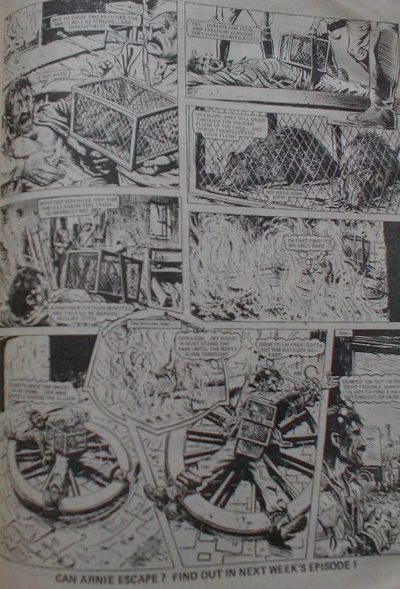
"3 Men In A Jeep" i guess is Bullet's take on Battle's "Rat Pack", having a bunch of Allied troops going their own way to take on the Nazi threat. Trouble is, the story and art are nowhere near as good.
Last strip is "Vic's Vengeance", the tale of a barrow boy fighting against the mob after his dad is killed by the mob. Very dull, very forgettable.
So that was that. Issue 1.
Nowhere as bad as i thought it'd be. I've always looked back on it with disdain and maybe later issues will bear it out - or back then i was reading it alongside Battle and Action and it couldn't compare - bit we'll see.
Biggest impression is though how similar things felt. Thinking about it a bit more and its a bits of a suprise as to just what came first:

Comic advertised as a new, tough, different comic to the norm for boys:
Bullet - 14 Feb 1976
Action - 14 Feb 1976
2000AD - 26 Feb 1977

Fictional Editor character who frequently pops up to talk to the readers:
Bullet - Fireball
2000AD - a year later with Tharg

Tough, do it my own way goverment agent:
Bullet - Fireball
Action - Dredger
2000AD - M.A.C.H 1

Kid rising out of the gutter of a poor, dysfunctional family to be a footie star player:
Bullet - Twister
Action - Look Out For Lefty

So, all in all, not the gamble i thought it'd be and quite an enjoyable read. But do i dare read more?
"AIEEEE!" Watch: A somewhat shortened "Aiee!" from a German trooper in "3 Men In A Jeep".

Friday 17 September 2010

Laser Eraser


There WILL be an update soon here - honest. Just as soon as Royal Mail sort out the mess...
As a filler, not part of the Blog's remit but lovely work that i want to show off, here's my Laser Eraser commission by top bloke Dylan Teague.
Mysta and Axel Pressbutton are two crimingly over-looked characters imo - great plots, great scripts and stunning work by Steve Dillon.
Can we PLEASE have a hardback collection Titan?

Tuesday 6 July 2010

Hookjaw in the raw


With kind permission of owner and top bloke Rufus Dayglo, thought you might like to see a classic page from the strip in its original form.
Its a perfect example of why Sola was THE artist for me on Action: slightly caricatured to the gritty end of the scale humans, highly original gore scenes and bizarro notions - why are the hammerheads up in the air.
Forget Tharg. Back then, Hookjaw was "The Mighty One" and no mistake. And so was Ramon Sola.
If the proposed new stories do go ahead it does beg the question - what on earth can an artist do to top this in the shock stakes? Not much i reckon.