Thursday, 24 November 2011

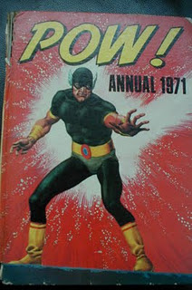
POW! annual 1971 - #9 - Mr Tomorrow


Right, at number 9 we have Mr Tomorrow, "Criminal From The Future!". Take one look at him and, yep, that's Lex Luthor in his nifty prison garb, but even more so when he's in suit and tie.

Its 2971 and the worlds worst criminal is on trial. Oddly, he's not named at all but, anyway, he's sentenced to "be cast into eternity" - which means being put into a box with a chair in it, the dreaded "Time-Ejector". Its not made clear just what ejecting into time involves, nor what casting into eternity means, but it must be terminal as they do keep going on how he's going to perish. He doesn't though - at the moment of the big event "the current doesn't seem to be regulating corectly" and he's sent back to present day America.
So far so good.
Except he goes on a crime spree, robbing banks across the world and can't be caught as "To me, everything here has already happened. I can live in history and remould it to my wishes as i already know what they're going to do next!".
Now that means either (A) He's a genius who has totally recall of all events that happened 900 years before, or (B) In the future he'd already learnt of what's to happen in the past and gens up on it.
Either way is strectching it, yes?
Anyway, ne notches things up and demands that he be made world leader and at that point things stretch to breaking point:
The authorities agree that he can't be stopped as "he never stays in one place long enough". To which one bod pipes up with the bampot "But you're forgetting one thing. This man must sleep!"
Eh? What?
What has that got to do with anything?
It gets even more bizarre - after they've decided they've got to find him then catch him asleep, Mr Tomorrow somehow knows and decides all of a sudden that he mustn't sleep. Kinda odd, if he has got foreknowledge, that he decides that right at the point the good guys point out that's how to get him.
So, anyway, he builds a super bomb but in the end blows up with it as he can't find his pills to stay awake and crashes his plane.
And it ends with the bod going "When it old you i wanted him asleep i was hoping he'd be foolish enough to try and stay awake".
So there we have it - Mr Tomorrow is from the future and, being from the future, it means he knows everything as it happens, everything that's said as its said.
Dear, oh dear.
As usual with this annual, its the art that made the impact (certainly not the plot here) and this one panel i was always fascinated by, even though its just a bit of perspective i found it odd and faintly disturbing.

Which sums this whole annual up.

Tuesday, 15 November 2011

2000AD 11 Feb 1978


Not visited Tharg's periodical for quite a while, so lets have a delve shall we?
Mr Dare is on the cover, replicating his Eagle days, and, boy, Star Wars was showing its influence in this tale - "Laser Swords", "Dark Lords" and a "Star Slayer Empire" - but its still a rollicking read and back then my number one tale. Looking at it now, the "Stomm" expletive seems odd outside of Dredd's world and the character himself could be anyone. In fact, in the action scenes, the way Dare carries himself and his innner monologues, that could be Johnny Alpha or even Dredd fighting there.
"Visible Man" was terrific, then and now, not for the plot - which is a bog standard man on the run tale - for the terrific art by Montero. It really is terrifically gruesome, each episode usually having a frame to show off Frank's predicimant, and here we have him wolfing down some wedding cake:

Brilliant Dredd tale by John Wagner under the nom de plume of "Howard", with brilliant early Dredd art by Brian Bolland. Its an excellent tale with an excellent premise - war between America and the Sov's is fought out by two small bands of warriors on Luna-1. Its got excellent action for sure but its unusual for the time in that it end with a proper anti-war message, literally rammed home by Dredd:

"Invasion" is still plodding on, but its got lovely, gritty art, which i thought was by Mike Dorey, but turns out its J. Clough. That look on Savage's face as he stands there with the rocket launcher is a classic:

And last up we have "Inferno", a truely naff tale - but Belardinelli's art is still oustanding.
Can't think of anyone else who could draw a simple fire extinguisher firing look so weird and unique:

"AIEEEE!" WATCH:
Oddly, considering the action going on, none.

Sunday, 13 November 2011

Captain Pugwash in the flesh


Not very on-topic, but he was great and a part of my childhood, sooo:
Rye art gallery are just to start running a collection of original art by the brilliant John Ryan - creator of "Captain Pugwash", "Mary, Mungo & Midge" and "Sir Prancelot" among others.
Will be nipping down to be 10 again and advise you to do the same if you can.

Friday, 11 November 2011

Spelling it out with Hookjaw

Blimey, it wasn't until i went on the 2000AD Forum to see what other folk thought of Strip that i learnt that, as well as being coloured, the lettering had been changed.
Never noticed it as i was so keen on studying the full colour - and i certainly didn't need to read it, as i'm darn near word perfect on this opening episode.
I can see why they did it, and they did it well, but i do prefer the standard for that time, typed text and those odd straight-lined speech balloons.


Looking closer, its rather curious as its not just a straight erasing of the original and putting a new one in.
In many cases the speech balloon has been moved elsewhere in the panel to allow for it, resulting in some of the art being covered up.
And the old balloon has been removed, either uncovering some previously unseen art or, if they were working from stats, drawing new art. If that's the case, its been done very well.
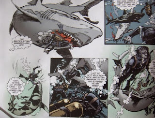
A good example is here, where the divers air tanks were originally obscured but are now on view:


Another alteration is to change some of the script itself:
As the unfortunate Bannion makes it to the surface, we originally had just the one balloon going:
"It's Bannion! What-? He's blown up!"
But now we've got two:
"Wait - there's Bannion!"
"Hell! He's BLOWN UP!"
And we've got the odd word removed here and the odd extra exclamtion mark added there.
But the oddest change is to remove some of the boxes with descriptive text. We've lost "The injured Great White turned savagely" and "Bannion dropped his weight belt" and "While the sharks finished Bannion, Mason surfaced"
Now, can understand why they'd remove them all, as that way of story telling is kind of dated now, but why remove some but keep others.
I'm hoping we're going to have a nice, indepth article in a future issue explaining the thought processes and decision making that was involved.

Thursday, 10 November 2011

Had a Strip


So, finally got me hands on one, sat down with a coffee and a bagel and had a good read.
Ticks all the right boxes for me straight away with John's editorial stating the aim was (A) have an action/adventure comic for all ages out there, (B) a way of publishing our childhood heroes again.
And they've certainly hit the mark on both counts - its a comic i'd be happy with my 11 year-old reading (and he will) and the feel of the characters, plots, script and art all seem continuations of the titles we all bought when nippers, before they died or "grew up".
Highlights for me?
"Age Of Heroes" The setting and premise are right up my proverbial, with lovely art by John Ridgeway. Lovely colouring too. I don't really need colour in my British comics as that's how i prefered my strips back then, but the colours used are pretty darn good here in Strip and i don't mind them.
"The Iron Moon" is terrific fun, with some great design work - may well have a go at making my own helicopter-thingy.
"Recovery Inc" is my favourite of the new strips, Mia coming across as Modesty Blaise equipped with Black Widows tech. Lovely, action packed stuff with superb art - more please.
"Hookjaw". Was inevitable that it'd be my number one wasn't it? Must say, was dreading a full-colour version - the original two page colour spread was garish and over the top and a product of its time, bit like the bright red blood in the Hammer films - but its done really, really well. Nice, subtle colours used well and sympathetically to the art, allowing the detail to still be seen. Top work fellas!
"AIEEEE!" WATCH:
Sadly none. It's only a matter of time before it pops up in "Hookjaw", but it'd be nice if it pops up in the new strips eh?

Wednesday, 9 November 2011

Combat Encounters Of A First Rate Kind!


Not apparent in this here cover shot, but that's the pun-tastic tag line to this issue of Battle Action from June 1978.
Behind the rather odd Ezquerra/Western/Cooper montage cover, we find:
Joe Colquhoun on "Johnny Red". Need i say more? Not really, but i will. His art here is truly up there with the best he did on Charleys War, raising this rather pedestrian episode up tons of notches. Only thing noteworthy in the script is this mouthfull from a Spitfire pilot, who warbles on while having a dogfight with Johnny. Talented multi-tasker and no mistake: "Its no use running Redburn! I know you're wounded and my spit can fly rings round that soup strainer you call a plane! You're coming back to face the music!"

Next up is "Hellman" and, again, top notch art from, for me, the best artist there was for this character - Mike Dorey. He always did incredibly gritty art but here, with these tales set on the Eastern Front, it suits the strip even more. And this train crash here also shows how well he could do action. Quite stunned to re-read this. From his very first tale, Hellman's been seen as a decent German, appallled by the Nazis in control. Its been a running theme, with him equally fighting them as much as the Allies. But here, we have a tale set in a concentration camp. A brave move, although we never see any of the inmates or the atrocities, the horror felt by Hellman's troops is handled well, and is played as straight as could be.

Skipping over "Spinball Wars" (as ever), we've "Major Eazy". Its not that good really - four pages telling the tale of Eazy and co going into the desert, blowing up a bit of road, covering it with sand, then waiting and watching as the German tanks roll over it and sink. Nice art by Carlos though - but who thought coloured speech balloons were a good idea?

"Dredgers" kinda dull, with so-so art from John Cooper.
"The Sarge" was good, with nice art by Mike Western and the squabbling of The Sarge's troops was similar in feel to the lighter episodes of Mike's ultimate gig, "Darkie's Mob".
All in all, an okay issue.
"AIEEEE" WATCH:
The most elongated utterance i've yet come across with a Russian "AIEEEEEEEEEEEE!" from Dorey's train crash in "Hellman".
A "Naieeeeee!" from a bloke run over by a bike in "Spinball Wars". Also there, we've a "Aieeeee!" from his team mate being blown up.
What is it with elongated one's this time? "The Sarge" has "Aieeeeeee!" fron a sniper being shot out of his tree.

Monday, 7 November 2011

POW! annual 1971 - #10 - Kash Pearce


As i've mentioned here before, if there was one copy of a title i could keep that would sum up my childhood comic reading, it would be this annual.
I loved and cherished it, being totally enthralled by the thrills inside - a mix of high thrills, odd plots, odder heroes and even odder villains.
And slightly disturbing artwork which made it all the more intriguing. The 9 year-old me wasn't to know that was due to the European artists that were used - all i knew is what i was reading seemed vaguelly like the Marvel heroes i knew from the UK reprints, but they had a slightly bizarre quality to them.
As i say, i've always cherished the book, one of only two that i've kept from my childhood right up to now.
And you can see here, on pages two and three, there's a nifty rolecall of the characters, to which i'd added my ratings of them:

So thought it'd be an idea to look closer at each one and see why i rated them as i did.
First up is "The Time Rider", Kash Pearce, who comes bottom of the list and i'm guessing i valued so little that i couldn't even be bothered to put a 10 alongside him.
Having a re-read, i can see why: Mr Pearce is a "million dollar rancher - and genius! Among his many incredible inventions, the mechanical horse!"
So, a loaded genius who, rather than setting himself in a lab benefitting humanity, choses to be a rancher. On a robot horse. Hmmmm...
He bungles an attempt to catch some bank robbers, gets told off by the police for interfering, goes off in a sulk and ponders at home: "If i had been back in the old west i'd sure have shown the law how useful my horse could be"
The lightbulb pings on as: "Hey! Why NOT go back to the wild west? My time transporter's almost finished..."
So, a genius inventor, with a robot horse and a working time machine, choses to be a rancher. Double hmmm...
Off he goes then, all garbed up, back to 1877 to defeat the dastardly Buck Sawyer. Which he does in an incredibly predictable, dull way. The only things of note? See the bottom of this post.
The only thing that i can really recall before re-reading this today are the daft fruit machine handles that pass for controls of horsey:

"AIEEEE!" WATCH:
Oddly, yes there is one and, boy, is it odd. We get an "Aieee!" from one of a bunch of native americans who're chasing our hero. He exclaims it as, i kid you not, the horse farts smoke in their faces.
Yep, a smoke screen produced from a bum-hole. VERY surprised the kid version of me didn't note that - surely it would've been the height of comedy back then?

Saturday, 5 November 2011

One day i will have a Strip


As i'm sure many of you will be aware, the oft-put back Strip Magazine went on sale in comic shops last Weds.
Had mine on order at my local one and could've picked up then, but decided to wait until tomorrow, when they are having a mini-con.
But had to change my work rota so i'm now working.
So went to get it today.
The owner had sold all his copies bar mine, but asked if i'd mind giving it up as someone going to the con hasn't got a local comic shop and was after one. So would i mind letting him have mine and i'll get my copy finally next Weds?
Said sure, so expect a ramble after then.