Tuesday 30 November 2010

Starlord #3


Mentioning the galactic freedom fighters weekly journal to us mere Earthlings back in that Battle post gave me a taste to have a wee revisit.
So here we have issue 3, cover dated 27th May 1978 and sporting an excellent Kevin O'Neil battle scene, highly reminiscent of the Chris Foss/Peter Elson etc SF paperback covers of the time. Except, where they did theirs with an airbrush, Kev is all line work. And might fine fine linework it is too. The details just amazing, especially on the pilots outfit and cockpit. Does this still exist? Would love to have it.
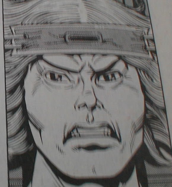
Turn the page and we have "Planet Of The Damned", in my mind a rather over-looked tale. It may be highly derivitive (especially of Hammers "Lost Continent") and, of course, once they get back the tales done, but on the way it was a lot of fun. Quite nasty too - really get the feeling it'd have fit into Action no probs.
The arts what makes it. Lovely work from Azpiri - guessing out of the Spanish studios - with some nice gross designs, and here we have the acid spitting aliens.
What's curious is the use of grey in this strip. It doesn't look like the regular Letratone used for shading, more like the strip is coloured but printed in black and white.
Which beggars the question - was the original in colour, does it still exist, and what's the chances of it being reprinted?

Next up, "Ro-Busters". My favourite back then but, as with most strips of the time, it wasn't anything to do with the characters - it was the robots, the ships and the weapons that had all the appeal. A good case is here in this excellent double spread from Dave Gibbons - would've killed for a Preying Mantis model kit.

Another example of this is next in "Strontium Dog". The appeal of it was Alpha's weapons and that we got Star Wars type ships and battles every week. Here we have a classic example of Carlos Ezquerras brilliant, off-beat, simple looking spaceship designs that aren't really. I've tried making ships with this mass of panel lines and detail but what Carlos makes look so easy to do is blummin' difficult to recreate.

We have the start of "Mind Wars" next, which is a pretty slow start, saved by Redondo's excellent art.

Finally we've got "Timequake", another strip screaming out for a graphic novel treatment. Dredger, sorry, Blocker - has to go back in time to fight an earlier version of himself to prevent a future nuclear war. Nice, easy, action-packed stuff with stunning work by (said it before and i'll say it again) the crimingly over-looked Ian Kennedy.
What i said before about "Planet" looking like it was in colour but printed B/W is true here as we have the first pages looking like this with the last page in colour.

Summing up, only issue 3 but most strips have settled in nicely and there's a neat mix of different tales, a deliberate move to enable us kids to train up to join Starlords army.
"AIEEEE" WATCH:
A drawn out "Aaaieeeee" from a guy in "Planet" - but, as he's being dissolved by acid, guess we can allow that.

Thursday 25 November 2010

The last ever Black Max?


Reading Lion & Thunder from the 21st October 1972 and i think i'm seeing the last ever episode of The Black Max.
On page 4 we have an ad for the following weeks issue featuring "Secret Of The Demon Dwarf", which is the spin-off series featuring the stunted scientist.
Which is making me think when, in his strip, Black Max is pursued and picked up by one of his Bats, with all the indications that he's about to be eaten, it really is the end for the fella.
Which would be a shame and really rather ainti-climatic if its true.

Monday 22 November 2010

Battle Action - 17 June 1978


I'd given up on this title by this point, much preferring to get my thrills through SF, what with Star Wars out only the year before, Who and Blakes 7 on the telly and, in print, 2000AD and the recently launched Starlord.
I know i came back to it though with the launch of "Charlies War" but this period is completely unknown to me.
So lets see what we've got.
"Johnny Red" i never really cared for, finding him a bit wet and whingy. Which he is here. But, as back then, its the artwork which is of note and, boy, does Joe deliver. Every bit as good as the work he'll go on to do with "Charlies", its got his trademark attention to detail, brilliantly executed action scenes, and interesting use of panelwork. Love this widescreen one at the bottom of the page, conveying even more speed to Johhny's Hurricane.
Mike Dorey takes a turn on "Hellman" and its yet another oddball idea - he and his tank hiding in a zoo's cage to ambush the Russians who've come along to shoot the animals for grub.
"Spinball Wars" is pretty apallaling, a VERY wattered down version of what it had been. Ditto "Dredger" who turns up later on.
"Rat Pack" has lovely, moody art from Eric Bradbury, which totally out-classes the story its telling - the team break in to their old prison to capture their old governer, take him to Belgium and swop him for a scientist the Germans have captured, who looks just like him. Straight away the Germans spot he's not the real deal. So why bother?
Last up is "The Sarge", a ho hum tale notable only for Mike Westerns stunning art.
Summing up, a good issue worth having the art - and that's it.
"AIEEEE Watch":
Quite a haul this time:
A variation of "Ahieeeeegh!" from inside a blown up tank in "Johnny Red".
"Hellman" has two - an extended "Aieeeeeeeee!" and a one e too many "Aieeeee!"
And THREE "Aieeeeeee"'s in "The Sarge"

Saturday 20 November 2010

The return of Rogue Trooper


Am finding the Prog a bit of a slog at the moment. Apart from the wonderful Defoe, it really isn't floating me boat at all, with all the strips seeming to be treading water and no thrills at all.
Did sit up and take note today though at this ad.
Rogue arrived just outside my '78 limit, but the strip could've easily fitted in the first issues in my opinion, what with its outlandish and really rather silly premise.
Wasn't a great fan of the character but really enjoyed the strip for its art and design-work - especially by the likes of Dave Gibbons, Steve Dillon and, especially, Cam Kennedy.
So am knocked out by this single image by the really rather excellent Staz Johnson, who seems to have gone back to the roots for his take on the fella.
And, teamed up with original writer Gerry Finley-Day, am hoping for unfeasiably huge tanks trundling across the battlefront, dosing out outlandish weaponry.

First shot of the new Dredd


Coming courtesy of the 2000AD site, here we are with Karl as the main man.
Its just the first pic but, from what we have, it looks like they're going with a 70's version of ol' Chinface, what with the rounded shoulder pad.
Which is a bold, unexpected, though nice move.
Of course its very early days yet but, from a purely visual point of view, must say i prefer some of the fan made costumes as seen here in pic 2.

Sunday 7 November 2010

Star Wars Weekly


The question is: Does this constitute a British comic? Sure, the main strip is from the US, with backup material also from the States, but it was produced weekly by Marvel UK, had each strip especially cut up into chunks, with new covers and, much later, original UK material.
For those reasons, i'm gonna give it a mention.
LOVED it when it first came out as, back then in '78, the weekly was the only way of getting new Star Wars material.
Odd as it may have been.
Leaving aside the 6 foot green Bugs Bunny and other bizarro notions, the main draw for me, aside what it was based on, was the work of Carmine Infantino.
Its kinda nice that the artist that was giving me my first superhero thrills back in '66 with Batman was now giving the 16 year-old me my SF thrills.
Looking back on it now, there's two things to note:

(1) How brilliant he was with the hardware, despite must not having very few refererence shots - the Y Wing is pretty much spot on, and how he uses them - those speed lines on the Falcon just scream speed don't they?
(2) The up and down of likenesses. While he never quite nailed the Stormtroopers and his Luke is just plain weird, what with the elfen eyes and Farrah Fawcett hair, his Leia is drop dead gorgeous, even with those silly buns.
Carmine, i salute you.
Another things to mention is:
I was going to buy the Dark Horse collection of these early stories, all ready to buy, flick through and... they're in colour.
Having years and years and years of pouring over these strips in black and white, it just doesn't look right AT ALL to have them in colour. That's how they were meant to be but guess, and this applies to all 60's Marvel strips too, i was so used to them being in b/w that anything else isn't right.
And. comparing the two, i'd rather go this way. You can see the penwork much better and guessing too that someone at Marvel UK applied the Letratone shading, which added for a much moodier and effective look.
Incidently, while i much prefer the 60's Marvel strips in b/w as that's how i was introduced to them in Mighty World Of Marvel et all, the same can't be said of DC. I only knew them from the full colour imports, so to flick through one of their Showcase collections with the likes of the Flash and Batman in monochrome just looks wrong.

Got me some Kev Walker


Just got this and figure i can include it here as Hammerstien, Rojaws and Walter the wobot all first appeared before its July '78 cut-off date.
As usual, top work from the Walker Droid, very small for such a detailed piece, and here it is as it appeared in print.
Think i said this before, but, looking at his b/w, precoloured work, Kev is right up there in my opinion of artists carrying on the fine linework of artists from the 60's and 70's.
In fact, if i won the Lottery, it'd be great to commission him to redraw the whole of Prog 1.
Lets check me ticket

Tuesday 2 November 2010

Bullet Number 2 - still ok


Here we are at Issue 2, one i remember only for the free wallet, which was a really flimsy red plastic - little tougher than those red fish you used to get in Christmas crackers that curled up in the palm of your hand if you were lying.

Anyway, turn the page and we're into some lovely Ian Kennedy art on "Smasher". Ian's rightly acknowleged for his stunning war artwork, but his SF work seems to always be over-looked. Here, his style is very similar to what he'll be doing a coupla years later on "Timecrash" over in Starlord, and is very nice indeed.
Shame the tale isn't up to it - Smasher blows up Red and Ferrets boat, knocks over the Golden Gate Bridge and kicks a tank. And that's it. The blurb says Doctor Doom is "power mad" but we've not seen anything so far in the way of giving ultimatums. If this was a strip from even just 3 years before, we'd have had that by page 3 of the first issue i reckon.

What else do we have? "Survivor" has Dick struggling to stay alive up that mountain, "Twisty" continues the off the rails kid making good and "3 Men In A Jeep" is still the comics take on Rat Pack. Both really dull.

"Fireball" was fun though and a good example of how stories could still whizz along, packing a lot in a short amount of space (unlike "Smasher").
By page 2 we've seen the hardman "trying to knock the stuffing out of "Katsoo", get a new mission and start off for Dover.
By page 4 he's missed the ferry, nicked a mates boat, crossed the channel, bought a bike and caught up with the train the kid he's trying to rescue is on.
Three more pages of pretty good action follows, leaving Fireball to neatly finish things off and end on: "I've got a power-boat waiting for me at Calais and its full speed back home to finish my duel with Katsoo!".
And with a thumbs up to us kids, he's off.

Two more things of note - "Wonder Mann" is a curious M.A.C.H 1 derivitive, who seems to use his computer agumented powers to battle bullies and be good at sport, while the back page shows us Issue 3's free gifts. And i remember those planes well - soapy plastic with propellers that fell off with the slightest suggestion of a breeze on them.

"AIEEEE" Watch: Still looking like its an IPC exclamation.